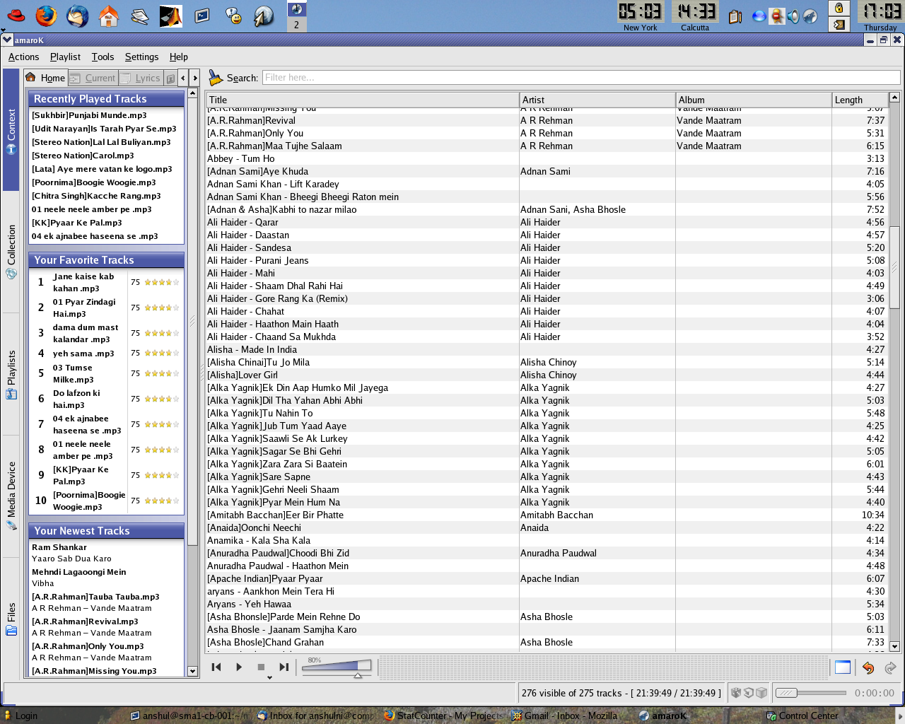
The best audio player on Linux (for me) is XMMS. That is a sad state of affairs, since I really would like to use a player with more organizational capabilities like playlists et. al. A lot of people recommended amaroK as “the latest and greatest” audio player for Linux, and so I proceeded to download and try it out. And I was sorely disappointed. Put very simply, the user interface sucks. And here’s why. This is a screenshot of amaroK 1.3.8 running on my FC4 system (click to view large):
Too much information
A music player’s job is to let me organize and play my music. Does that require an interface which has three, yes three, scroll bars on a 1280×1024 screen? On the main page of amaroK, there’s one scroll bar in the main window that shows the current playlist, one scroll bar that spans the left “context” pane, and one scroll bar that scrolls the tabs at the top of the left context pane. In the same vein, there is a set of vertical tabs to the extreme left as well as horizontal tabs in the context pane – which look just plain ugly for one thing, and seem to be totally useless for another. Why have separate views for “collection”, “playlist”, “files”? Whats the difference, and why would I want to use all of them? The context pane itself seems to be weird. Do I really need to have three panes showing me “new tracks”, “recent tracks” and “favourite tracks”? Especially since the smart-playlists, under the playlists pane already has most of these options as “playlists”?
Simple things are hard
I wanted to make a playlist of some of my favourite songs. Simple ask, isn’t it? So I go to the playlists pane and try to think how I’d make a new playlist. No option in the menu for creating a new playlist. Through the menu, I can manage scripts, set dynamic mode, remove duplicate and dead entries, but I can’t create a new playlist. Strike one. I try the next thing, right click on the playlists folder in the playlists pane – and yes – there I see an “Add a playlist option”. Mysteriously, it opens a dialog box titled “add playlist” and asks me to select a playlist file. If I type a new name into the field and press “open”, nothing happens. Strike two. I then notice there is an option for “save playlist as”. So I go to the “All Collection” smart playlist, and type the name of one of my songs in the search bar, figuring I’ll create a playlist first, and then add other songs to it. Sure enough, when I do “Save playlist as…” it asks me for a name and suggests the name of the artist of the current song for the playlist. Pretty helpful. Having saved the playlist, I open up the playlist and find, to my horror – that the saved playlist contains my entire collection, not just the one song. Strike three. And out.
Later I found out the right way – you can drag a song from the current playing playlist to somewhere just under the playlists folder in the playlists pane and it creates a new playlist with just that one song. Or you go to Collection – which also lists your songs in a tree-like structure and add them to a new playlist. Now, maybe I’m the one who’s dumb and any reasonably computer savvy user could have figured this one out. But I can’t help but feel that the actions required are way too obtuse.
To me, the most important items in a music player are the play/pause/previous/next buttons, the volume control and the time progress of the current song. The buttons and volume control are in an off center, hardly visible location, and look almost as if they were added as an afterthought. The time progress has been relegated to the status bar.
At the end of the day, amaroK feels like it’s creators decided on the zillion features to put into it, then just threw them into the GUI haphazardly. With all the horizontal and vertical tabs, undo/redo buttons, four menu items for configuration (you can configure shortcuts, configure global shortcuts, configure toolbars, or configure amaroK), menus and submenus for each pane – it feels not like a music player, but a high-end image editing application like Photoshop.
And yes, I know amaroK is completely configurable and themeable, viewable in different modes and I can switch around most of the options to suit my purpose. But I (or your average user) isn’t going to hunt around configuration options and documentation for a music player. Is it too much to ask for the first screen to be simple and intuitive and then let the user add other things if he wants to? And yes, I do like a lot of the features, especially the global shortcuts and the on-screen display. Which is why I wish it would just be designed better.
8 Comments